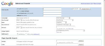
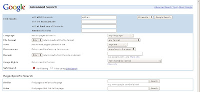
Really , the user interface of Firefox 3 rocks. Text boxes and other form fields have a nice smooth corners and select menu item is similar to the one you find in gnome 🙂 .
The old form elements are shown in this image.
New here comes the new interface of the same webpage in Firefox 3 🙂
Wow, looks like any web developer can make web pages which will look really cool in Firefox 3.


hey hari, that might have been the case in Linux… but it still looks the same as in Firefox2 and by the way, Firefox 3 should be called Gran Paradiso 😉
Yes it uses system UI to generate the form fields 🙂
Yes it can be called as Gran Paradiso or Minfield, but will take time get used to the new name 😉
i guess thats just a theme da. This is something which can be easily customized in firefox 2 also with some tweaks i guess.
Gran Paradiso is just the code name. It will supposedly be released as Firefox 3.
Mozilla just doesn’t want anyone to think Firefox sucks because they used buggy alphas – so they give them a different branding.
i like for yahoo website…..